Category:
Mobile App & Desktop App
Client:
View Design
Duration:
4 weeks

TallyDekho is a mobile-first accounting application designed for small businesses and freelancers to easily manage expenses, income, invoices, and financial insights. The app focuses on simplicity, clarity, and quick access to business data through an intuitive and user-friendly mobile experience.
Problem Definition
Background
In many small businesses across India, shopkeepers and owners still manage their daily accounts using notebooks or basic manual methods.
As their business grows, they try to move to digital tools like Tally. However, these tools are often complex, desktop-focused, and not easy for everyone to use—especially for people who are not very comfortable with technology.
Core Problem
Small business owners find it difficult to manage their daily financial activities—like tracking income, expenses, and cash flow—because existing accounting tools are complicated and not designed for simple, everyday use on mobile.
Pain Points
Tally and similar tools feel complex and difficult to learn
Daily entries take more time than expected
Most tools are not easily accessible on mobile
Important insights like profit/loss or cash flow are not easy to understand
Too many features create confusion instead of helping
Users often feel unsure or afraid of making mistakes
Target Users
Small business owners
Shopkeepers and local retailers
Users who want quick and simple access to their business data on mobile
Opportunity
There is an opportunity to extend the Tally experience to mobile by creating a simplified interface that focuses on essential features and everyday tasks.
This can help users quickly access, manage, and understand their financial data without going through complex desktop workflows.
Goal
Reduce dependency on desktop systems and accountants for basic day-to-day tasks.
Provide quick access to financial data on mobile
Simplify key workflows for daily usage
Improve clarity of financial insights through clean UI and graphs
Make the experience faster, simpler, and more accessible
User Research
Research Objective
To understand how small business owners and shopkeepers in India manage their daily accounting processes, and identify the challenges they face while using traditional methods (manual bookkeeping) and transitioning to digital tools like Tally.
Additionally, the goal was to explore how a mobile-first solution can simplify financial management and make accounting more accessible for non-technical users.
Research Methods
User Interviews
We conducted small-scale interviews with shopkeepers and small business owners to understand:
Their daily accounting workflow
Tools they currently use (manual or digital)
Challenges faced while managing finances
2. Expert Interview (Chartered Accountant)
We also interviewed a Chartered Accountant (CA) and accountant to understand:
Critical financial data that business owners often overlook
Common mistakes in financial tracking
Key features that are important for proper business accounting
3. Product Analysis (Tally)
We analyzed Tally and similar accounting tools to identify:
Complex user flows
Feature overload
Limitations of desktop-only systems
4. Language & Usability Study
We focused on simplifying the interface by:
Using simple, non-technical English
Avoiding complex accounting terminology
Designing for ease of understanding

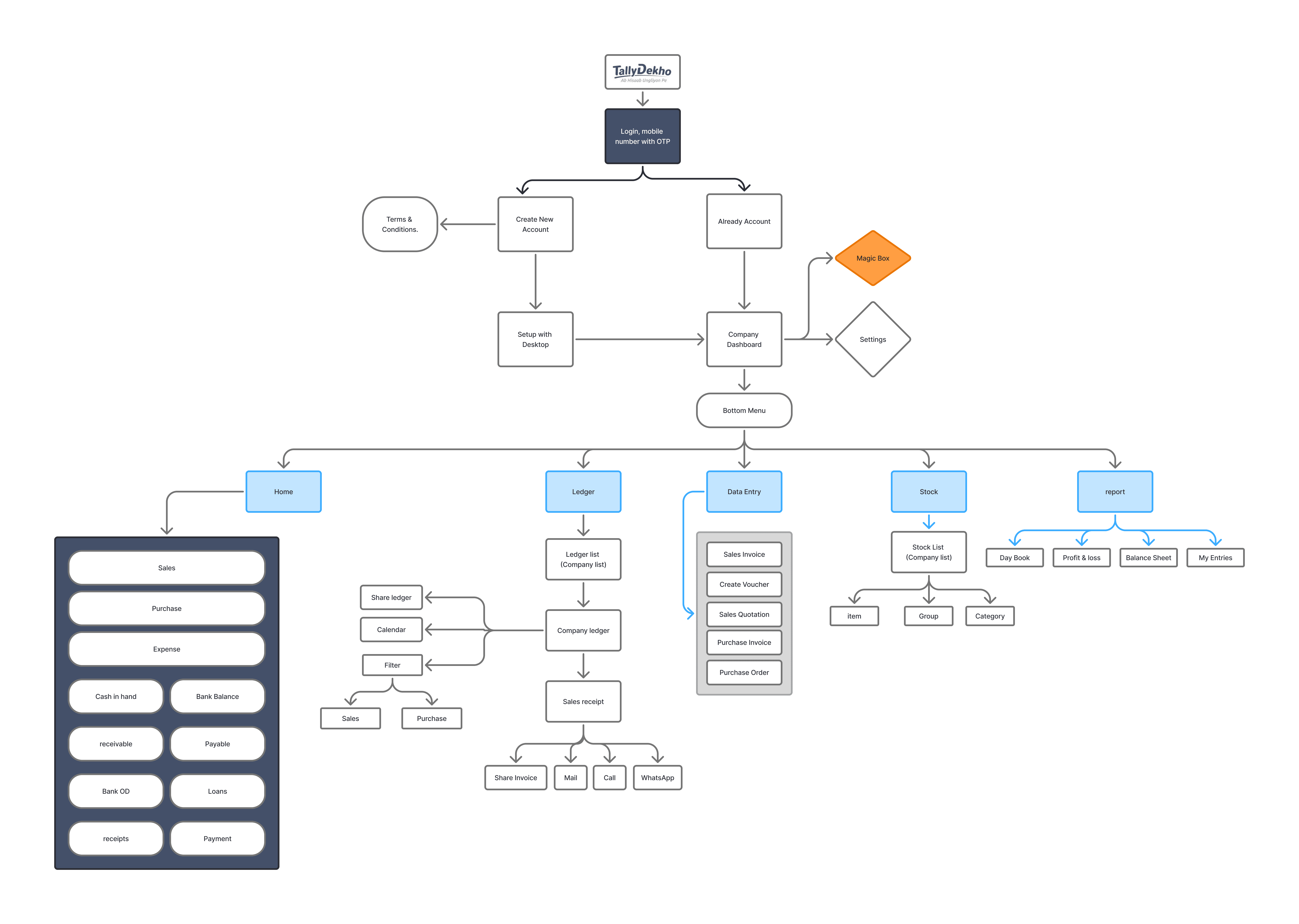
User Flow
The user flow was designed to break down complex accounting tasks into simple and intuitive steps.
Instead of exposing users to multiple features at once, the experience focuses on key actions such as adding transactions, viewing financial data, and accessing reports.
Each flow is optimized to reduce the number of steps, allowing users to quickly complete tasks without confusion. The goal was to create a smooth and efficient experience that works well for everyday business use.
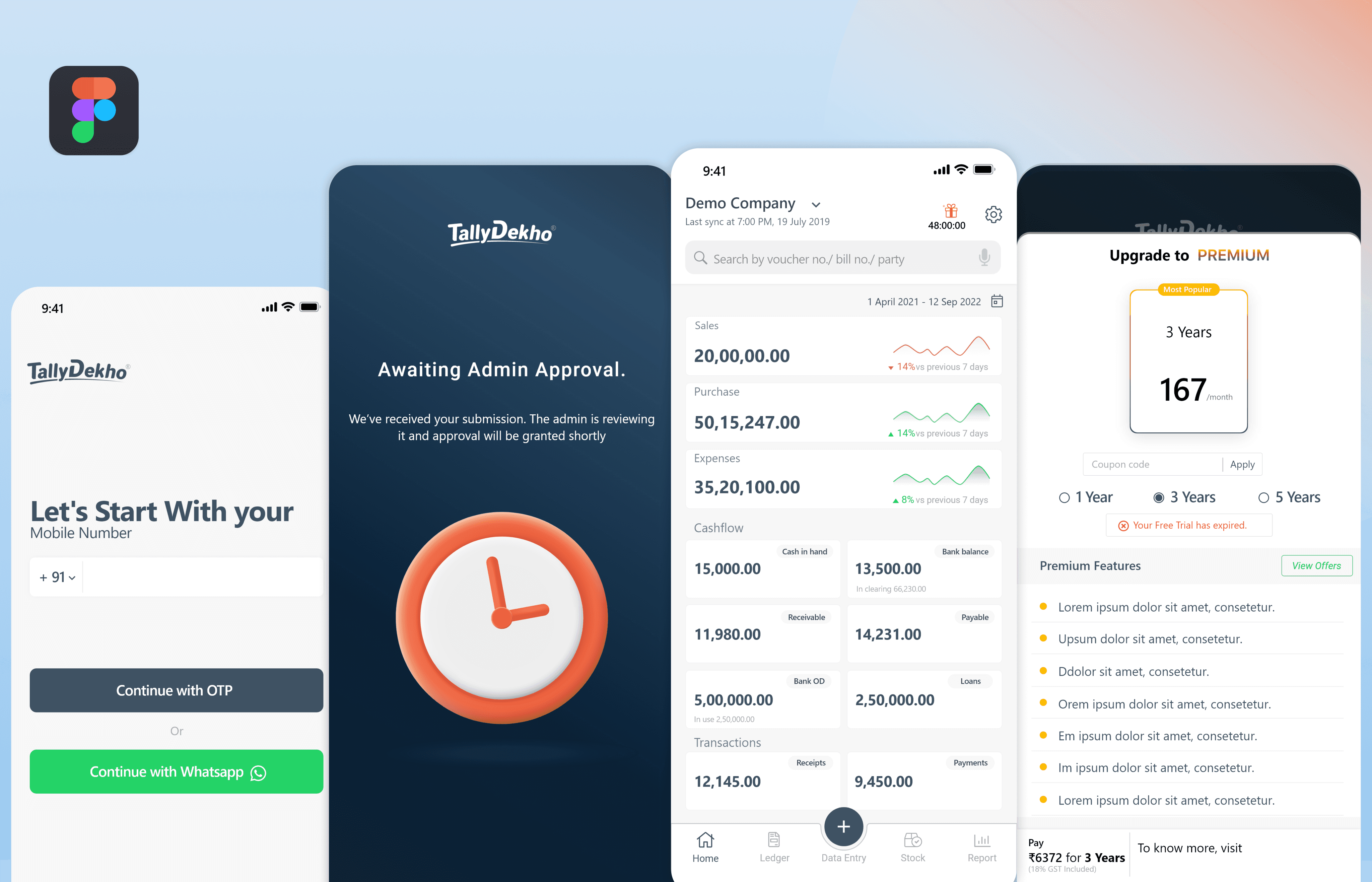
Wireframe
Wireframes were created to define the structure and layout of key screens before moving into visual design.
The focus was on content hierarchy, spacing, and usability—ensuring that important information like financial data and actions are easily accessible.
Low-fidelity wireframes helped in exploring multiple layout options and simplifying user interactions, resulting in a clean and easy-to-understand interface.

Wireframe
The interface focuses on simplicity and clarity, presenting financial data in a clean and structured way. A minimal approach, clear hierarchy, and visual indicators help users quickly understand and manage their business finances.
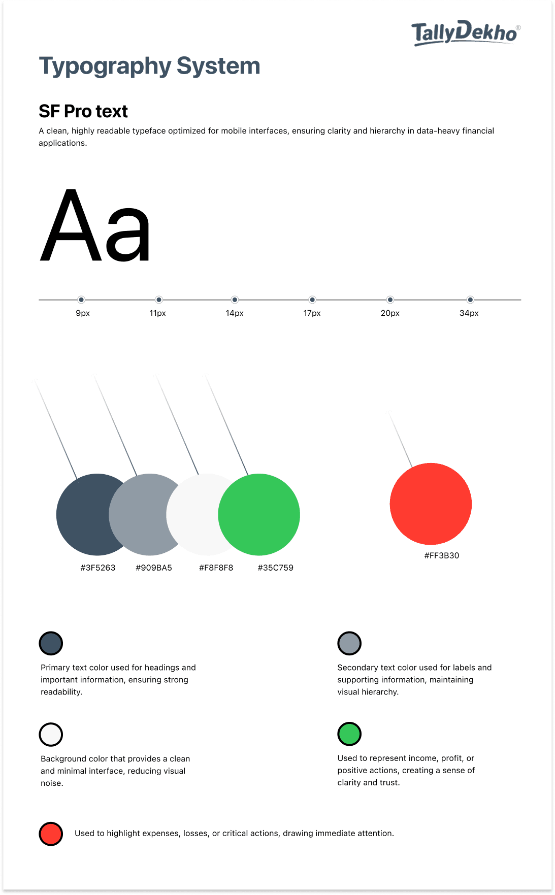
Typography
Typography was designed to ensure clarity and readability across the application, especially for data-heavy financial content.
SF Pro Text was used as the primary typeface due to its clean appearance and excellent readability on mobile screens. A clear hierarchy was established using different font sizes and weights to guide users through important information such as balances, transactions, and labels.
Special attention was given to highlighting numerical values, making financial data easy to scan and understand. The overall approach keeps the interface simple, structured, and accessible for everyday use.
UX Decisions
The UX decisions focused on simplifying complex accounting workflows and making them easy to use for everyday business needs. The goal was to reduce friction, improve clarity, and help users manage their finances quickly and confidently.
1. Simplified Core Workflows
Complex accounting tasks were broken down into simple, step-by-step actions, making it easier for users to complete tasks like adding transactions and viewing reports.
2. Mobile-First Approach
The experience was designed for mobile usage, allowing users to access and manage their financial data anytime without relying on desktop systems.
3. Focus on Essential Features
Only the most important features required for daily use were included, reducing confusion and improving overall usability.
4. Clear Data Hierarchy
Important financial information like balances and amounts were visually prioritized, making the interface easy to scan and understand.
5. Quick Access to Key Actions
A prominent “Add Entry” action was introduced to enable fast and seamless transaction entry with minimal steps.
6. Clean and Minimal Interface
The UI was kept simple and uncluttered to reduce cognitive load and help users focus on essential information.
